Discover the Alluring Range of Copper Shades for Your Designs
Unveiling the Fascinating Characteristics of Copper Shades
Copper hues present a breathtaking assortment of colours that emanate warmth and establish a connection with nature, mirroring the innate properties of the metal itself. This enchanting palette spans from delicate, soft oranges to deep, rich reds, making these colours a highly coveted choice for an extensive array of design projects. The charm of copper hues lies in their capacity to bring forth both striking and sophisticated elements in various interior environments, fashion statements, and artistic expressions. Some prominent examples of these captivating shades include:
- Bright Copper
- Burnished Copper
- Rose Copper
- Dark Copper
- Red Copper
- Penny Copper
- Antique Copper
- Soft Peach Copper
Integrating these vibrant hues into your designs can significantly elevate the aesthetic appeal of a space or a garment. This versatile palette can be tailored to suit a wide variety of themes and environments, ultimately enhancing the overall design narrative and aesthetic experience for all who appreciate it.
What Are the Scientific Foundations Behind the Creation of Copper Tones?
The remarkable attributes of copper play an essential role in the formation of its exquisite hues. This metal is celebrated for its exceptional capacity to reflect light, resulting in shades that can shift based on the angle and intensity of the illumination. This characteristic allows designers and artists to manipulate copper tones for various effects, culminating in a visually captivating experience that captures attention. Moreover, the oxidation process is crucial, as it transforms the surface of copper and introduces new shades. By grasping the science behind these mesmerizing colours, creators can choose and blend tones that yield the desired fiery accents, significantly enhancing the overall impact and appeal of their artistic endeavors.
Identifying Premium Quality Copper Hues: What to Look For?
When selecting copper tones, prioritizing quality is vital. Premium copper shades showcase a rich, consistent colour that retains its vibrancy over time without showing signs of fading. To recognize superior hues, consider these essential indicators:
- Uniformity: Ensure that there is a consistent hue across the entire sample.
- Depth: Look for shades that exhibit a layered quality, indicating complexity.
- Durability: Assess whether the colour withstands light exposure over time without losing its integrity.
- Richness: Choose hues that radiate inherent warmth and vibrancy, enhancing their overall allure.
Selecting high-quality copper hues can elevate any project, providing enduring visual charm that captivates onlookers. Ensuring that your selected colours meet these crucial criteria can significantly influence the success of your design, underscoring the importance of quality.
Masterful Techniques for Blending Copper Shades to Create Striking Accents

What Techniques Are Employed by Professionals to Blend Copper Shades?
Professionals in the realms of design and colour theory frequently employ a variety of established techniques when blending copper hues to create captivating fiery accents. One prevalent method is layering, where lighter shades are applied first, followed by deeper tones to impart depth and richness. For instance, in interior design, a warm copper accent wall can be beautifully complemented by lighter copper-toned furnishings, enhancing the overall warmth and cohesiveness of the space. Another technique is blending, where hues are mixed on the palette to achieve a smooth transition between shades, resulting in a dynamic visual effect. In fashion design, creators may combine copper hues with complementary warm tones such as deep oranges and golden yellows to craft statement pieces that command attention and convey movement and energy.
How to Attain Professional Results with Copper Hues?
Achieving professional results with copper hues necessitates a meticulous approach to mixing and application techniques. To begin, always start with a carefully crafted colour palette that aligns with your project’s vision. Here are actionable steps to consider:
- Begin with a base hue that resonates with your desired fiery effect.
- Gradually incorporate darker shades to add layers of depth and complexity.
- Experiment with various ratios to discover the ideal balance that complements your design.
- Apply hues in thin layers, ensuring that each layer dries fully before adding more.
This method of controlled mixing and application will empower you to achieve the professional quality of design that captivates and engages your audience, whether in interior design, art, or fashion, ensuring your creations leave a memorable impression.
Avoiding Common Mistakes When Mixing Copper Hues: What to Keep in Mind
Mixing copper hues can be a delicate process, and several common errors can lead to unsatisfactory results. One frequent mistake is over-mixing, which can dull the vibrant effect that copper hues are known for. To maintain the inherent vibrancy of these colours, it is essential to mix only until the desired consistency is reached. Additionally, neglecting to consider the surrounding colours can result in clashes that diminish the overall aesthetic; therefore, always contemplate the context in which the hues will be applied. Moreover, failing to test hues before full application can lead to unexpected results. By being aware of these common pitfalls and taking proactive measures to avoid them, you can significantly enhance the impact of your designs and create breathtaking visual experiences that resonate with your audience.
How Lighting Conditions Can Enhance the Beauty of Copper Hues?
Lighting plays a fundamental role in the appearance of copper hues, dramatically altering their characteristics and visual impact. For instance, natural light can amplify the warmth and vibrancy of copper, making it appear more radiant and dynamic. Conversely, harsh artificial lighting can wash out these hues, rendering them flat and less engaging. To leverage lighting effectively, consider implementing the following strategies:
- Maximize natural light by positioning copper accents near windows or other light sources.
- Experiment with various light bulbs; warm white tones can enhance the richness of copper’s hues.
- Incorporate adjustable lighting to modify intensity and direction, thereby enhancing depth.
- Utilize reflective surfaces nearby to bounce light onto copper tones, creating a shimmering effect that captivates.
By understanding how lighting interacts with copper hues, you can design spaces that not only look beautiful during the day but also transform with changing light conditions, adding an extra layer of sophistication and allure to your designs.
Choosing the Perfect Copper Hues for Your Creative Endeavors
What Factors Should Guide Your Selection of Copper Shades?
Selecting the ideal copper hue requires thoughtful consideration of the desired intensity and context of your project. Key factors to contemplate include the intended mood, the environment, and the existing colour scheme, all of which play critical roles in determining which shade will be most effective. For example, if you wish to create a warm and inviting atmosphere, it is advisable to opt for lighter, peachier copper hues. Conversely, for a bold and dramatic effect, deeper shades like dark or red copper can be particularly striking. Always consider how the hue interacts with other elements in the space or design; testing samples in situ can provide invaluable insights into how the selected shade performs under real-world conditions, ensuring it aligns with your aesthetic objectives.
Key Factors to Influence Your Choice of Copper Hues
Several critical elements can greatly influence your selection of copper hues, and understanding these aspects can lead to a more cohesive design. The first consideration is lighting, as both natural and artificial light can dramatically alter the appearance of hues. The surrounding colours also play a significant role; for instance, copper hues often appear more vibrant against neutral backgrounds, while they may clash with certain bold colours. Additionally, the texture and material of the surfaces where the hues will be applied can influence how the colours are perceived. For example, a shiny copper finish may reflect light differently than a matte finish. By taking these factors into account, you can make informed decisions that enhance the overall aesthetic appeal of your designs and ensure harmony within the space.
How to Harmoniously Integrate Copper Hues with Other Colors for Maximum Effect?
Copper hues truly shine when paired with complementary or contrasting colours that either harmonize or highlight their fiery essence. Common choices include warm tones such as deep reds, oranges, and yellows, which can create a cohesive look filled with warmth and vibrancy. Alternatively, pairing copper hues with cooler colours like teal or navy can produce a striking contrast, allowing the copper to stand out beautifully. Experimentation is essential; consider laying out different combinations to visually assess their impact. A successful pairing can elevate your design significantly, creating a compelling visual narrative that resonates deeply with viewers and enriches the overall experience.
Fundamental Techniques for Mixing Copper Hues to Create Fiery Accents
What Essential Techniques Should You Master for Mixing?
Understanding the foundational mixing techniques is crucial for achieving stunning fiery effects with copper hues. Two of the most effective methods include layering and blending. Layering involves applying multiple coats of different shades, allowing each layer to dry before adding the next. This approach can create depth and richness, which is vital for producing vivid, fiery accents. In contrast, blending focuses on seamlessly mixing hues on a palette to achieve a smooth transition between colours. This technique can yield beautiful gradients that mimic the natural variations found in copper itself. Mastering both methods provides invaluable tools for any artist or designer aiming to amplify the impact of their work and create visually captivating pieces.
How to Create Stunning Gradient Effects with Copper Hues?
Creating gradient effects with copper hues requires a thoughtful approach to blending and application. Start by selecting two or more shades of copper that you wish to transition between. Apply the lighter shade first, using a brush or sponge to create a base layer. Gradually introduce the darker shade by applying it sparingly at the edges and blending it into the lighter hue using gentle strokes. This technique fosters a fluid transition that can evoke movement and depth within your design. Additionally, consider employing a wet-on-wet method, where wet paint is applied directly onto wet surfaces, further enhancing the gradient effect. Experimenting with pressure and angle can also yield unique results, enabling you to craft dynamic and eye-catching designs that truly stand out.
Advanced Techniques for Elevating Your Designs with Copper Hues
Advanced mixing techniques for producing fiery patterns with copper hues involve sophisticated layering methods and varying intensity to achieve intricate results. One notable technique is glazing, where translucent layers of colour are applied over a dry base layer. This approach allows light to penetrate the upper layers, resulting in a glowing effect that enhances the vibrancy of the copper tones. Additionally, artists can employ stippling or splattering techniques to introduce texture and visual interest to their work. By manipulating the intensity of the hues through different mixing ratios, you can create a distinctive palette that captures the essence of fiery accents in a bold and innovative manner, distinguishing your designs from the competition.
Exploring the Diverse Applications of Copper Hues Across Design Realms
How Do Copper Hues Enhance Interior Design Aesthetics?
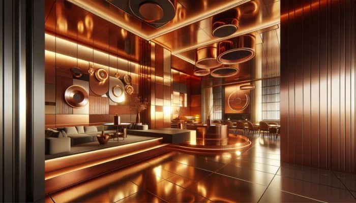
Copper hues possess an extraordinary ability to elevate interior spaces, infusing them with warmth, sophistication, and a touch of luxury. One effective strategy to incorporate copper hues is through accent walls painted in a rich copper tone, which sets the stage for complementary furnishings and decor. Copper accessories, such as lamps, vases, or picture frames, can serve as striking focal points that draw the eye and create visual intrigue. Furthermore, when utilized in textiles like cushions or curtains, copper hues can help unify various elements of a room while adding depth and texture. This versatility empowers designers to create cohesive and inviting spaces, ultimately enhancing both the aesthetic and functionality for occupants.
How Are Copper Hues Employed in Fashion Design?
Within the fashion industry, copper hues serve as powerful statement colours that can transform an ordinary outfit into something remarkable. Designers frequently incorporate these shades into a diverse range of garments and accessories, as they evoke feelings of warmth and opulence. For instance, employing copper-toned fabrics in evening wear can result in eye-catching pieces that stand out at high-profile events or on the red carpet. Accessories, including handbags or shoes in copper hues, can complement a variety of ensembles, adding an unexpected twist to any outfit. The adaptability of copper hues also encourages creative experimentation; layering these tones with other warm colours can yield dynamic outfits that exude confidence and sophistication, leaving a lasting impression on onlookers.
In What Ways Can Artists Integrate Copper Hues into Their Creative Works?
Artists across diverse disciplines harness copper hues to infuse their work with depth, interest, and emotional resonance. Whether in traditional painting, sculpture, or digital art, these colours can convey rich narratives and evoke a broad spectrum of emotional responses. For example, in landscape painting, copper hues can capture the warmth of a sunset, creating dramatic contrasts with cooler colours. In sculpture, artists may utilize copper finishes to enhance the tactile quality of their pieces, inviting viewers to engage with the work on multiple sensory levels. Digital artists can experiment with copper hues using software, layering different tones to create vibrant compositions. The versatility of these hues makes them an invaluable resource for artists seeking to convey complex themes and emotions throughout their work.
What Role Do Copper Hues Play in Product Design?
In product design, copper hues can dramatically enhance the visual appeal and marketability of various items. From electronics to homeware, incorporating copper tones can lend products a modern, luxurious touch. For instance, kitchen appliances finished in copper can revolutionize a space, transforming everyday items into striking design statements. Additionally, home decor products like vases or picture frames designed with copper hues can elevate the aesthetic of any room. The usage of these hues can also signify quality and craftsmanship, appealing to consumers’ desires for products that reflect their personal style. By thoughtfully integrating copper hues into product design, brands can differentiate themselves in a competitive marketplace, attracting a discerning audience who appreciates unique and stylish offerings.
Research-Driven Benefits of Mixing Copper Hues for Fiery Accents
What Psychological Impacts Are Associated with Copper Hues?
Copper hues elicit a variety of psychological effects, making them powerful tools in design and art. These hues often conjure feelings of warmth, comfort, and even nostalgia, fostering a welcoming atmosphere in any space. Studies indicate that warm colours can enhance mood and promote a sense of well-being. Key psychological benefits associated with copper hues include:
- Evoking warmth and comfort in environments
- Promoting a sense of stability and security
- Encouraging creativity and inspiration, fostering innovation
- Facilitating social interaction and engagement among individuals
Incorporating copper hues into your designs can significantly enhance the user experience, resulting in spaces and products that resonate on a deeper emotional level, ultimately amplifying the overall impact and effectiveness of your design.
How Do Copper Hues Affect Visual Perception?
Copper hues play a critical role in shaping visual perception, attracting attention and creating a sense of depth within a composition. Their unique reflective properties can create a dynamic interplay of light and shadow, resulting in heightened visual interest that captivates viewers. Research has shown that incorporating copper tones can guide the viewer’s eye, directing focus to key elements within a design. This ability to manipulate perception makes copper hues an invaluable resource for both designers and artists. By utilizing copper hues effectively, you can enhance not only the aesthetic appeal of your work but also its functionality, encouraging deeper engagement and interaction from your audience.
What Aesthetic Advantages Do Copper Hues Offer?
The aesthetic benefits of copper hues are numerous, significantly contributing to the overall charm of various designs. These hues possess an inherent richness that can elevate a space or piece of art, imbuing it with a sense of luxury and sophistication. The ability of copper tones to harmonize with a wide range of colours further enhances their versatility, allowing for creative expression across different mediums. Additionally, copper hues can foster a warm, inviting atmosphere, making environments feel more welcoming and comfortable. By harnessing these aesthetic advantages, designers can create experiences that are not only visually stunning but also emotionally resonant, ensuring a lasting impact on viewers.
How Can Integrating Copper Hues Transform Interior Spaces?
Incorporating copper hues into interior spaces can significantly enhance their warmth and elegance. These hues have the unique capacity to soften harsh lighting and create a welcoming atmosphere, making rooms feel more inviting and comfortable for both occupants and guests alike. Research suggests that spaces adorned with copper tones can increase perceived value, enhancing their overall appeal. By implementing copper hues in key design elements, such as furnishings, accents, or wall treatments, designers can create layered, engaging environments that invite exploration and relaxation. The transformative power of copper hues lies in their ability to craft a cohesive narrative within a space, ultimately elevating the overall design experience and enriching the lives of those who inhabit it.
Essential Tools and Materials for Mixing Copper Hues
What Tools Are Critical for Mixing Copper Hues?
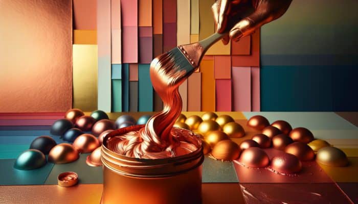
When it comes to effectively mixing copper hues, possessing the right tools is crucial for achieving your desired results. Essential tools include high-quality brushes that allow for precise application, mixing palettes for seamlessly blending colours, and sponges for introducing texture and depth. Furthermore, palette knives can prove beneficial for mixing larger quantities of paint and applying thicker layers. Artists may also find spray bottles useful for techniques requiring a more fluid application. Each of these tools plays a significant role in achieving the desired effects, so selecting high-quality options can dramatically enhance both the mixing process and the final results of your creative endeavors.
How to Choose the Right Materials for Mixing Copper Hues?
Selecting the appropriate materials is critical for achieving optimal results when mixing copper hues. High-quality pigments are essential, as they often exhibit superior colour retention and vibrancy compared to lower-quality alternatives. Consider investing in professional-grade acrylics or oils specifically designed for mixing. Additionally, the medium used can influence how the colours interact; for example, a slow-drying medium allows for extended blending capabilities, while quick-drying options may force you to work more swiftly. Testing different brands and types of materials can help you discover which combinations yield the best results, facilitating a more tailored and successful mixing experience that aligns with your artistic vision.
Best Practices for Maintaining and Cleaning Your Mixing Tools
Proper maintenance and cleaning of your mixing tools are vital for ensuring their effectiveness and prolonging their lifespan. After each use, thoroughly cleanse brushes with soap and warm water to remove any paint residue, thereby preventing damage to the bristles and maintaining their shape. For palette knives and mixing palettes, ensure that all paint is removed, as dried pigments can impede future mixing efforts. Regularly inspect your tools for signs of wear and replace them as necessary. Moreover, storing tools in a clean, dry environment can prevent degradation and contamination of your materials, ensuring consistent quality in your work and enhancing your creative outcomes.
What Safety Measures Should You Implement When Working with Mixing Materials?
Safety should always be a top priority when working with materials for mixing copper hues. Wearing gloves and masks is essential to protect against potentially harmful pigments, especially when using powdered pigments or potent solvents. Ensure your workspace is well-ventilated, particularly when working with chemical-based mediums or paints, to avoid inhaling harmful particles. It’s also advisable to keep your materials out of reach of children and pets, as some pigments can be toxic if ingested. By following these safety precautions, you can work confidently and securely while exploring the creative potential of copper hues, enabling a safe and enjoyable artistic experience.
How to Properly Store Your Tools and Materials for Longevity?
Proper storage of your tools and materials is crucial for extending their lifespan and preventing degradation. Store pigments in a cool, dry place away from direct sunlight to maintain their vibrancy and effectiveness. Brushes should be kept upright to preserve their shape, while palettes can be covered or sealed to prevent dust accumulation. Ensure that lids on containers are tightly secured to avoid drying out. By maintaining an organised and well-cared-for workspace, you can ensure that your tools and materials are always ready for use whenever inspiration strikes, facilitating a smooth creative process.
Effective Strategies for Successfully Mixing Copper Hues
How to Experiment with Different Colour Combinations Effectively?
Experimentation is fundamental to uncovering unique and exciting results when mixing copper hues. Start by selecting a range of copper shades along with complementary colours to work with. It is beneficial to create small test swatches to observe how different hues interact and blend with one another. Consider mixing copper hues with both warm and cool tones, as this can yield fascinating results and unexpected outcomes. Additionally, remain open to adjusting ratios and blending techniques, as this can lead to captivating designs that stand out from conventional mixtures. Embrace the process of trial and error, as it can lead to innovative designs that push the boundaries of traditional colour mixing, enriching your creative repertoire.
Best Practices for Achieving Fiery Accents with Copper Hues
To achieve fiery accents using copper hues, it is essential to adhere to best practices that ensure optimal results. Begin with a strong base hue that sets the tone for your project; this can be enhanced with darker or lighter shades to create depth and dimension. Gradually build up layers, allowing each layer to dry before applying the next, as this helps maintain vibrancy and prevents muddiness in the final outcome. Utilize a combination of brushes and sponges to explore different application techniques, which can introduce texture and dimension to your work. Finally, continuously evaluate your work in progress under various lighting conditions to ensure that the colours retain their desired impact and resonance.
How to Troubleshoot Common Challenges When Mixing Copper Hues?
Even experienced artists and designers encounter common challenges when mixing colours, and being aware of these can significantly enhance your mixing experience. One frequent issue is uneven mixing, which can occur if hues are not blended thoroughly. To address this, utilize a palette knife for more effective mixing and ensure you are working with the correct proportions of colours. Colour shifts, where mixed hues change unexpectedly, can also happen; this often results from the interaction of different pigments. To troubleshoot this, maintain a colour mixing journal to document ratios and outcomes, allowing for better consistency in future projects. Adjusting your technique and being mindful of the materials used can help mitigate these issues, leading to more successful mixing results and a more satisfying creative journey.
Frequently Asked Questions About Copper Hues
Which colour combinations complement copper hues most effectively?
Copper hues beautifully pair with warm tones like reds and oranges, as well as cool shades such as teal or navy, creating striking contrasts and harmonious blends that enhance the overall visual appeal.
How can I prevent copper hues from fading over time?
To prevent fading, utilize high-quality, lightfast pigments and apply protective coatings or sealants to preserve the vibrancy and longevity of your copper hues, ensuring they maintain their visual impact.
Can copper hues be used for outdoor applications?
Yes, copper hues can be effectively utilized in outdoor applications, but ensure that the materials are suitable for such use and can withstand various weather conditions without compromising their integrity.
What are the best methods for cleaning brushes after using copper hues?
Clean brushes immediately after use with soap and warm water, thoroughly rinsing to remove all paint residue. For stubborn paint, consider using a dedicated brush cleaner that can effectively break down pigments.
How can I create a metallic finish using copper hues?
To achieve a metallic finish, utilize metallic copper paints or add metallic powders to acrylic mediums, applying in layers for depth and shine that enhances the overall richness of your design.
Are there specific brands recognized for high-quality copper hues?
Several brands are well-regarded for their quality copper hues, including Winsor & Newton, Golden, and Liquitex. Always opt for professional-grade products to ensure the best results in your artistic endeavors.
How do I ensure colour consistency when mixing copper hues?
Maintain a colour mixing journal to document ratios and outcomes, ensuring you use the same brands and types of pigments for consistent results across projects, thus enhancing the reliability of your mixing practices.
Can I mix copper hues with other metallic colours?
Absolutely, mixing copper hues with other metallic colours like gold or bronze can create striking effects and depth, enriching the visual interest and complexity of your designs.
What tools are best for achieving gradients with copper hues?
Utilize high-quality brushes and sponges for blending, along with palette knives for mixing. A spray bottle can also be advantageous for achieving smoother gradients and transitions between shades.
How important is lighting when working with copper hues?
Lighting is crucial, as it can dramatically alter the appearance of copper hues. Always evaluate your work under various light conditions to ensure the desired effect is achieved, enhancing the overall presentation.
Connect with us on Facebook!
The Article: Mixing Copper Hues for Fiery Accents: A Guide appeared first on Amitys Hair Salon.
The Article Copper Hues: A Guide to Fiery Accent Mixing Was Found On https://limitsofstrategy.com
The Article Copper Hues: Mastering the Art of Fiery Accent Mixing First Appeared ON
: https://ad4sc.com


No responses yet